At DMSi, our customers access our software – Agility – by logging in via web portal. The look and feel of the web portal needed to be updated to fit our new brand standards. I worked with another member of the Marketing team to not only update the look to fit the new brand, but also to improve usability, better match the web-based Agility product design system, and encourage customers to use the RDP application.
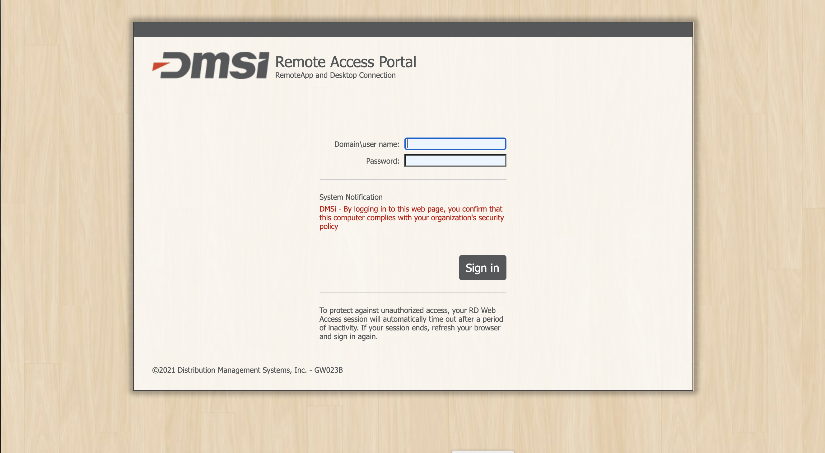
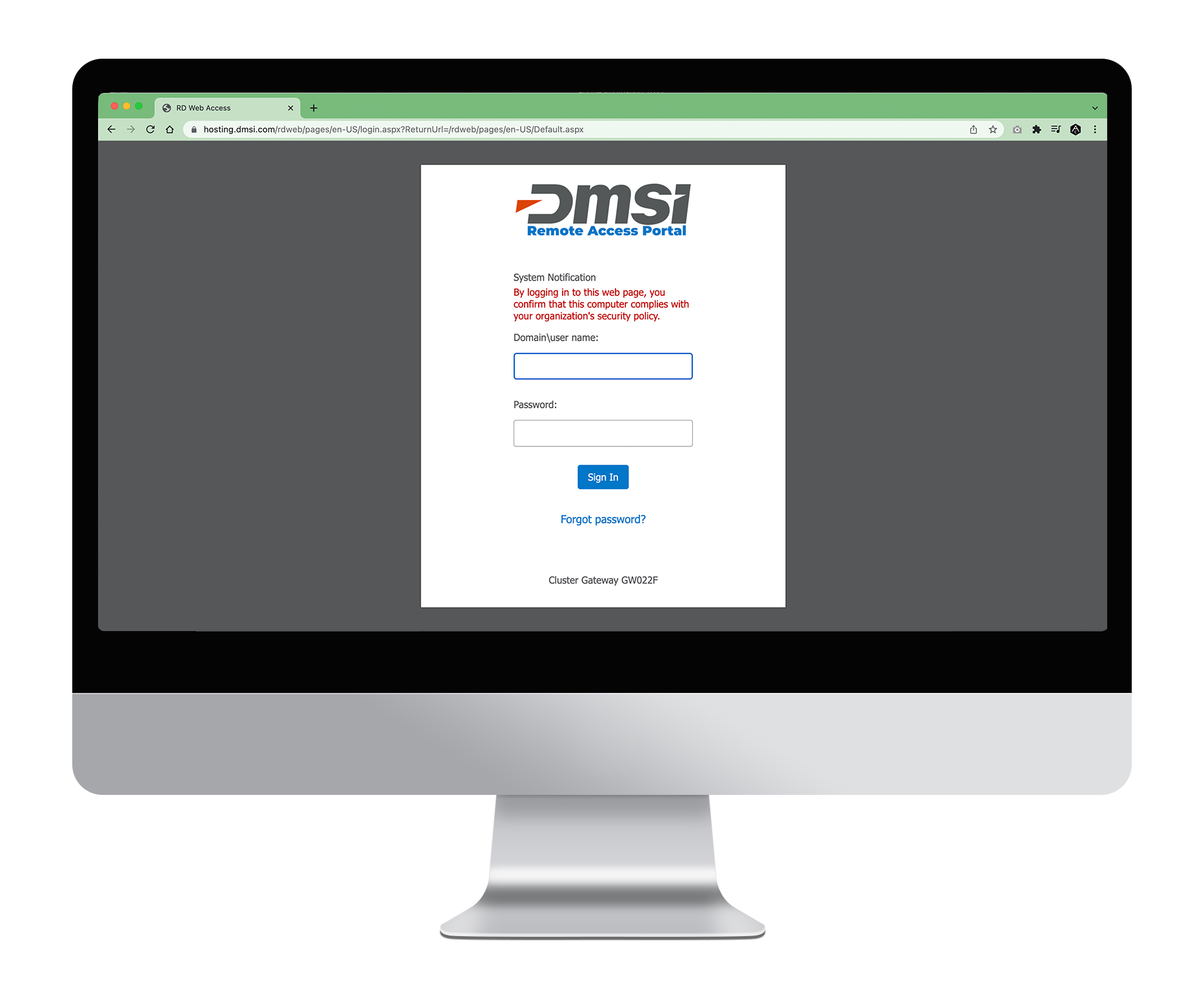
The login portal has two screens. First, as shown above, is the original username and password authentication screen to be redesigned. We interviewed the Systems Engineering team to identify the parameters of the project, and they told us that most elements currently included on the above screenshot would need to stay. They also mentioned that, at times, there would be multiple system notifications/error messages. Space would need to be left to accommodate this.
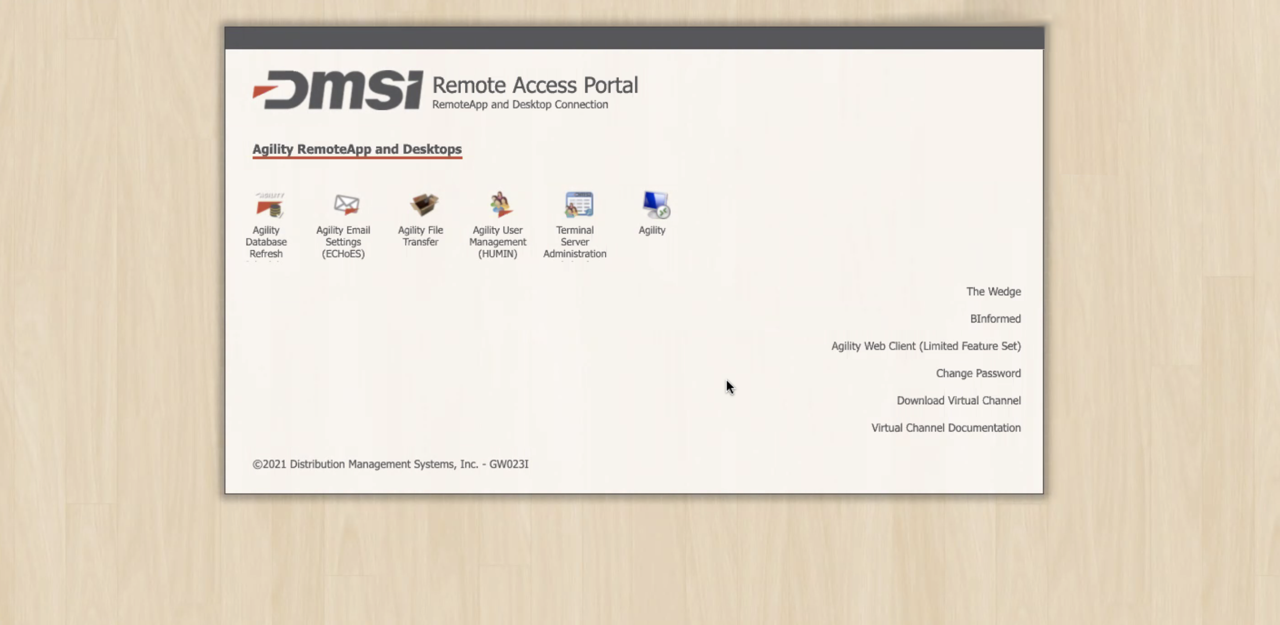
The second screen, once username and password have been authenticated, is the portal to various applications and processes. The app icons on this screen, shown under “Agility RemoteApp and Desktops,” change based on the user. There can be a maximum of 7 icons shown here at once.
Pain points for users were the small size of the icons and fonts, order of icons and list not being optimized to most-accessed items, and a disjointed experience between the look/feel of this portal with the rest of the applications.
Marketing also identified an opportunity to encourage users to learn more about the RDP app to try to increase adoption.
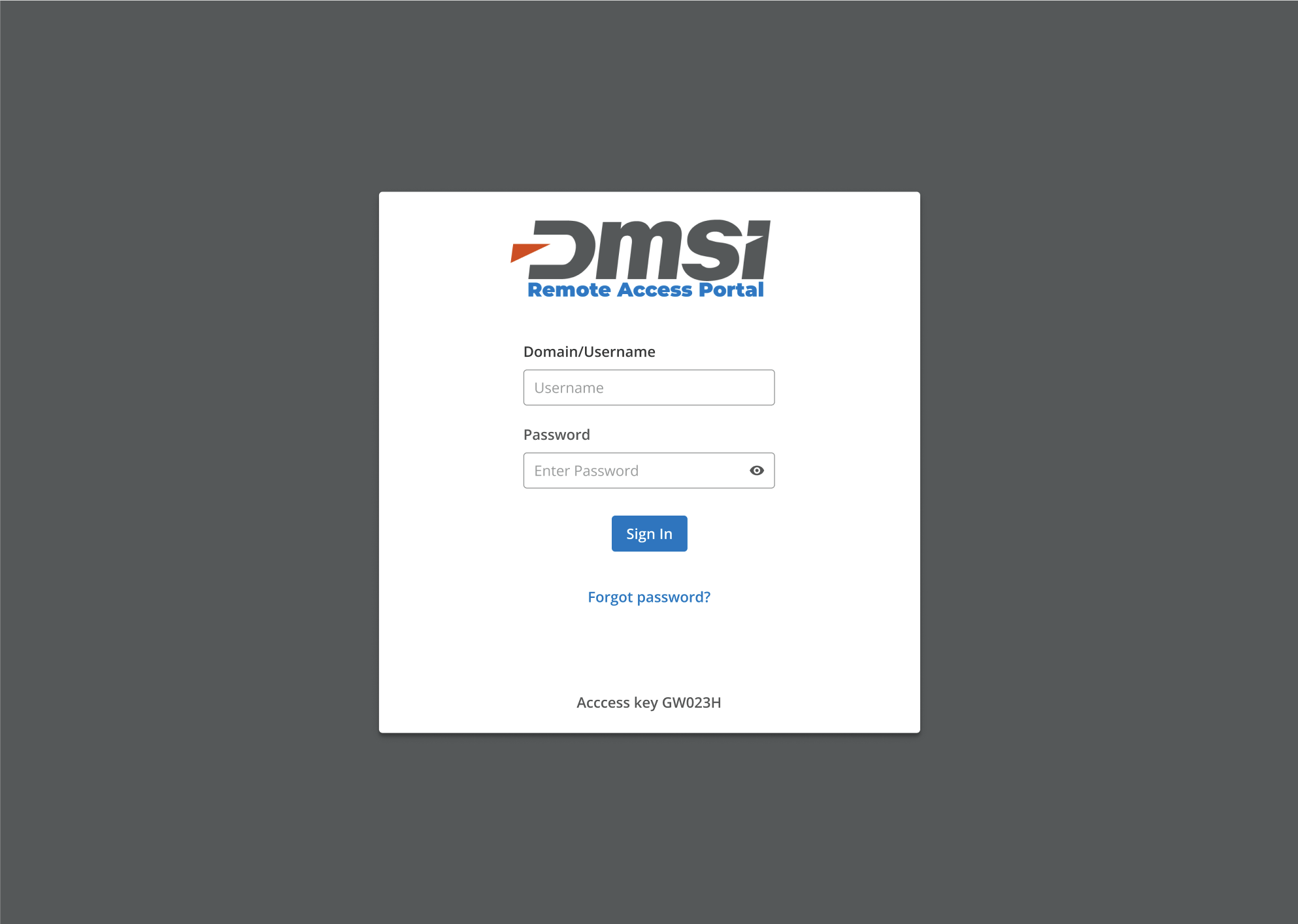
The above was my proposed redesign for the initial authentication screen. I worked with members of the product design team to learn to use Figma and to use components of their design system to create a seamless experience between the login screen and the product.
I updated the top logo to our new brand standards, consolidating the subtext to a more streamlined message. I also updated the colors, fonts, and alignment. In addition to aesthetic changes, we added a “forgot password?” prompt to assist users in changing their password if needed.
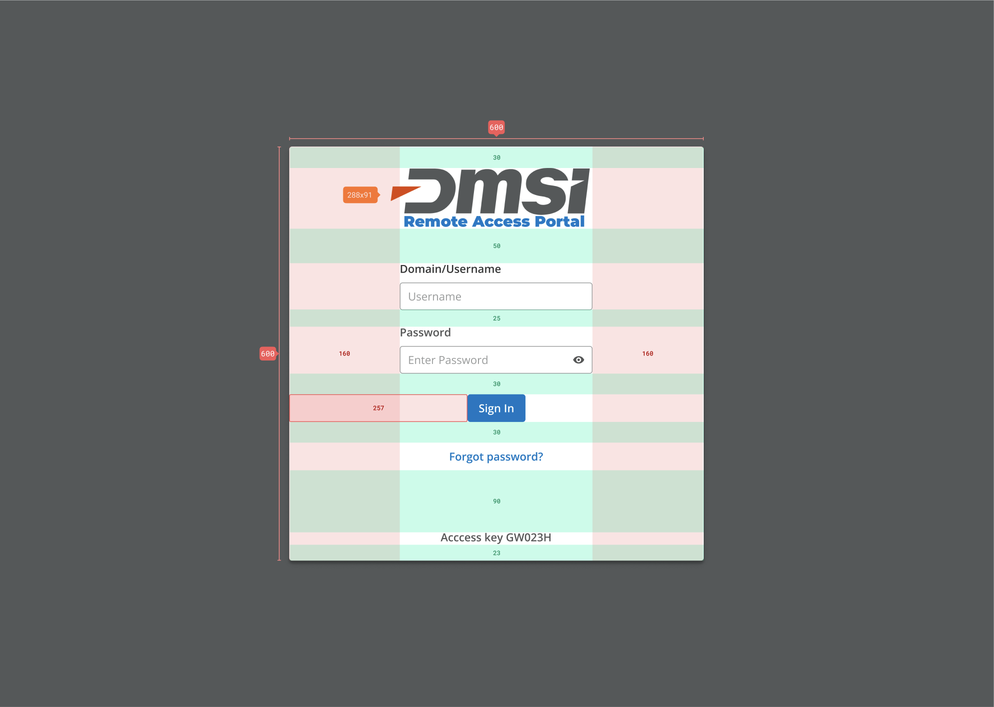
I redlined the screen to make it easier for development to execute on the design.
The above shows the final, live site.
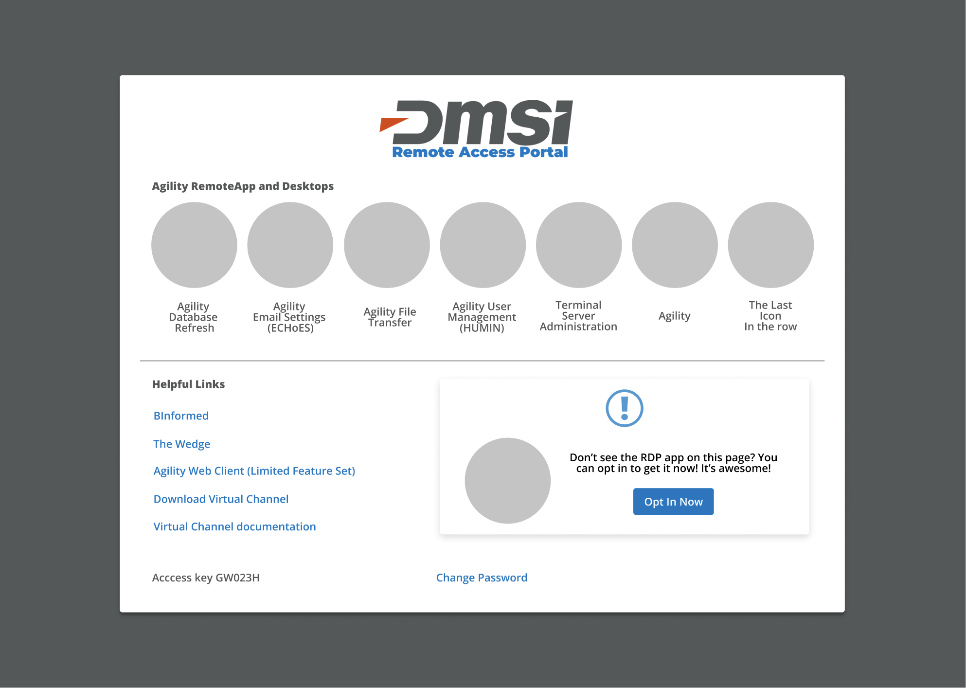
Above is the initial mockup concept for the main portal page. I increased the size of the icons and text to address user concerns of legibility. I included 7 icons on this mockup to account for the maximum possible number.
I moved the list of links to the left and added a “Helpful Links” header to that section to give users context for that list. We reordered the list to put most-used links at the top and moved the most-used link, “Change Password”, to the bottom for more visibility as well as consistency with placement on the previous login screen.
We added a modal box for the RDP app. In the final design, this was changed from “opt in now” to an informational blurb about the app.

The live version of the portal page is shown above. From the time of the mockup, more icons could potentially be shown, leading to crowding. The next phase of this process will involve consolidating the icons on this screen and redesigning them to give them a look consistent with the new brand.